
To be effective, a sales email needs to catch your subscribers’ attention right away, hold that attention throughout your pitch, and convince subscribers that your offer is valuable enough for them to take action. That’s a lot to do in a small space, especially if you’re not a trained copywriter, but it is possible, and this list of sales promotion email examples will show you how to do it.
In this guide, we’ll take a close look at 10 incredible sales emails from companies selling both products and services in a variety of industries. I’ll share my thoughts on why each email is effective, if there’s anything the email could have done better, and what lessons you can take for use in your own sales emails. I’ll also briefly discuss some best practices for sales emails.
Let’s dive into it!
10 Sales promotion email examples
1. Evernote

What makes it great
This email from Evernote is great for a few reasons:
- High-quality visuals. The graphic at the top presents the offer in a bright, visually appealing manner, using contrasting colors for the text so that it’s easy to read. The smaller images throughout the text are also high-quality, simple images that emphasize the point each section is trying to make.
- Excellent organization. The text is broken down into a list, with each point consisting of a bold headline and a regular-text sentence expanding on the headline. This makes it easy for subscribers to scan the text and grab the information they need.
- Brevity. This email tells subscribers everything they need to know about Evernote Premium and the sale in just a few sentences. This is important when you consider that the average person receives 121 emails per day.
- Multiple calls to action (CTAs). There’s a CTA at the beginning of the email and another at the end of the email. This gives subscribers who are eager for the sale the opportunity to grab their discount without reading the full email while also making sure that subscribers who read the full email don’t need to scroll back up to take action.
All in all, this sales email presents the offer in a clear, visually appealing way while also making it easy for subscribers to take action.
What you can learn from it
The big lesson to take from this email is that your sales email doesn’t need to be complicated to be attention-grabbing. In fact, in today’s busy world, the simplest approach is often the best one.
2. MacPaw

What makes it great
This email from MacPaw is another great example of how much you can accomplish in a short email. All you really need is a headline, a sentence or two to explain your product and the discount you’re offering, and a call to action.
Moreover, this email offers immense visual appeal. The color scheme is vibrant and eye-catching, while also using contrast to make sure that all of the text is easy to read. The illustration of a jumping cat evokes a mood of action and also reinforces the MacPaw brand, while the gift boxes reinforce the message of “gift this to your friends” in the text.
What you can learn from it
This email is a great example of how you can use illustrations to create powerful visual experiences in your emails even if you run a service-based business and/or your work is difficult to turn into high-quality photos.
3. Quickbooks


What makes it great
This email from Quickbooks is a great example of how to make a longer email effective. Each paragraph is contained in its own box, with its own headline and accompanying image. This makes it easy for users to follow what’s happening and focus on the sections with the information they’re most interested in.
Every section also has its own CTA, and these change as the email continues, with each new call to action using stronger words than the last: find out more, learn more, buy now. This increases the level of urgency as the email goes on, encouraging the user to take direct action.
What you can learn from it
Long emails aren’t always a bad thing, but if you’re going to write a long email, you need to make sure it’s organized in a way that makes it easy for people to scan. This means dividing it into clear sections with visual cues like headlines, boxes, illustrations, or photos. You also want to make sure there’s a call to action in every section.
4. Collin Street Bakery

What makes it great
There are a few great things about this flash sale promotion from Collin Street Bakery:
- Bold colors. The bright colors used in this email make it feel almost like it’s popping out of the screen at you, drawing in your attention. These colors are used in the banner to draw you into the email itself, then again for the CTAs and other key pieces of information to make sure you see the most important parts of the email.
- A focus on urgency. This email uses a few different phrases to convey urgency: limited time, flash sale, 48 hours, now $5 off, hurry and order. Some of these phrases are also bolded and written out in capital letters to attract more attention.
- Multiple calls to action. You’ve probably noticed that I mention this in almost every description. That’s because it’s important! If your subscriber has to scroll down at any point, they should still be able to see a CTA when they do.
All in all, this is a simple yet powerful sales promotion email.
What you can learn from it
There are a lot of lessons you can take from this email. For me, the most important lesson is to carefully consider the colors you’ll use and where you’ll use them. Bright colors like the ones in this email attract the eye and make images feel like they’re popping right out of the screen. You can also use one of those same colors instead of the regular bolded black to make important parts of the text more eye-catching.
5. Headspace

What makes it great
The main thing that makes this email from Headspace great is the GIF of a person holding a cone filled with melting ice cream. The animated image is bright, colorful, and has just enough motion to draw the eye without it becoming too distracting. The image of someone watching their ice cream melt too fast conveys a sense of summer and a sense of urgency: this season, and sale, are melting away like the ice cream. And there’s a CTA built right into the GIF.
Another great thing about this email is the copy. In the GIF, you learn what the sale is and when it runs out. If you scroll down, you’ll see this information repeated alongside a quick explanation of how Headspace can help you. While this second section isn’t strictly necessary, it does a good job of reinforcing why you should buy Headspace in the first place.
What you can learn from it
Dynamic elements like GIFs can make your emails more interesting, holding your subscribers’ attention for longer so that you can make your pitch. If you want to try this out, check out our guide to best practices for using GIFs in email.
6. Homage

What makes it great
This email from Homage is a great example of how to promote a multi-product sale, whether you’re discounting a specific type of item or everything in your store. There are high-quality photos of each item, all paired with a title of the item and a call to action. The viewer knows right away what’s on sale and what they need to do.
Another thing I like about this email is how the color scheme of the email complements the color scheme of the products. The main elements of the email are black and red, colors which also feature prominently in the items for sale. This makes the email feel more cohesive.
What you can learn from it
The main lesson to take from this email is that if you’re going to promote multiple products in one email, each product needs to have its own CTA. You should also keep individual product descriptions and images small to make sure the email is a reasonable length.
7. Vinyl Me, Please

What makes it great
There are a few things that stand out about this email from Vinyl Me, Please:
- Excellent photography. The photo chosen for this email displays the products in a unique way and evokes a sense of community, tying it into the holiday it’s connected to.
- A unique way of connecting to the holidays. This email takes a different approach from most marketing campaigns sent around this time of year, tying the sale into the concept of giving thanks and Thanksgiving itself rather than the consumerist frenzy of Black Friday.
- Thematic colors. The warm colors of the background and the text reinforce the holiday theme of the email.
All in all, this is a simple, effective email that runs counter to a lot of the flashier marketing campaigns seen throughout the holiday season.
What you can learn from it
The big lesson from this email is that if you’re going to run sales during the holiday season, you need to find a way to differentiate yourself from the million other sales happening at that time of year. And sometimes the best way to do that isn’t to make your email flashier, but to make it simpler.
8. Casper

What makes it great
The main thing I like about this email from Casper is the way it ties Casper’s products into the time of year without relying on big holidays that are frequently used for marketing. The emphasis on Daylight Savings Time and how it affects your sleep makes the email feel timely and serves as an excellent reminder of why having a good mattress is important.
Another thing I like about this email is the photography. The image is prominent enough to draw the eye, the bed looks extremely comfortable, and the model appears to be sleeping peacefully. If you’ve ever struggled with sleep, you’ll find yourself drawn in by the image, maybe even thinking that a Casper mattress might give you that same kind of sleep.
What you can learn from it
The big takeaway here is that when it comes to seasonal sales, you don’t always have to tie your promotions to a popular holiday. You can highlight a different seasonal event or a smaller holiday, like running a sale on World Book Day if you publish books.
9. Yellowbird

What makes it great
There are a couple of different things I like about this email from Yellowbird:
- Simple yet evocative imagery. The only image above the fold is the banner at the top, which uses a silhouette to make it feel like the email’s background is fire. This establishes a connection between the email and the idea of heat, or in this case, spice.
- Copy with character. The text of this email doesn’t simply tell you “our salsas are on sale”. It creates an image using words and phrases like “landed” and “a new flame to town”. This use of language gives the email, and the brand as a whole, a sense of fun and excitement. The CTA, “Get your dip on”, reinforces this sense.
All in all, this email is a great example of what you can accomplish when you commit to a specific brand voice.
What you can learn from it
The big lesson to take from this email is that your email campaigns can become even more powerful if you take some time to think about the character of your brand, then use language to build that character around your brand. You can create images, use descriptions that relate to a specific theme like fire or heat, and make your copy fun.
10. Moo
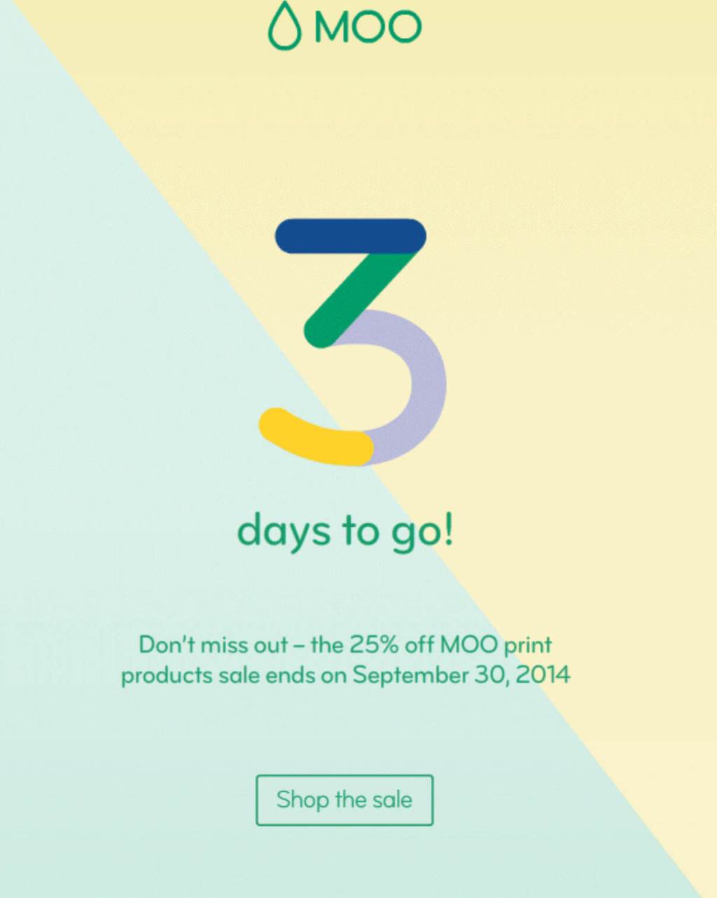
What makes it great
The main thing I like about this email from Moosend is that it uses a countdown to create a heightened sense of urgency. Three days might be a lot of time for some things, but the small number makes Moo’s subscribers feel like they need to act now or risk missing out. And the company isn’t using a countdown timer, which is important because countdown timers don’t work on the most recent iOS.
Another great thing about this email is how quickly it gives you all of the information you need. You learn how long the sale is, what’s on sale, and how big the discount is in two sentences. This allows subscribers to view the email and make a decision in a matter of seconds.
What you can learn from it
This email is a great example of what you can do with a simple countdown campaign. Moo doesn’t need to create a new email for every day; all they need to do is create the template, vary the text a little bit from day to day, and schedule the varied emails over the course of three (or more) days. You can learn more about this type of email marketing in our guide to countdown campaigns.
Best practices for sales promotion emails
Working on a sales promotion email of your own? Here’s a quick list of best practices to follow:
- Only use high-quality images. If you can’t get high-quality photos, pay for illustrations or create your own graphics using a tool like Canva. Remember, an image can be as simple as the discount you’re offering written in a fancy font.
- Don’t complicate the layout. In most cases, a one-column layout is best since it reduces distractions and keeps things easy to read on a mobile screen.
- Emphasize a sense of urgency. Encourage your audience to act right away by emphasizing when your offer ends and using words like “hurry” and “now”.
- Make sure your subscribers can always see a call to action. A CTA should be highly visible on every screen, including above the fold (before users scroll down).
- If multiple products are on sale, use multiple CTAs. Specifically, make sure there’s a link to each product you’re advertising.
- Organize your campaign so it’s easy to read. Use visual cues like boxes and headlines to separate different items or topics. You can also use bullet points to create white space and make text easier to read.
- Put extra care into your holiday sales. The steady stream of marketing emails people get throughout most of the year becomes a flood in November and December, with dozens of daily promotions for Black Friday, Cyber Monday, Christmas, and Boxing Day. If you’re running a sale at this time of year, you need to put in extra work to make it different from what people are already getting. But that doesn’t mean you need to send an elaborate email. In fact, you might stand out more if you take the simple approach.
- Consider the brand experience. You want to use colors, images, and words that fit with subscribers’ existing understanding of your brand. These subtle cues reinforce subscribers’ ideas about, and relationship with, your brand.
If you’re gearing up to run an ecommerce sale, you might also want to look at our guide to WooCommerce emails.
Final advice on promoting your sales with email
These sales promotion email examples work for a variety of reasons, but they all have one thing in common: the people who created them were strategic about every word, image, and color. If you put the same time and care into every campaign, you can make email your most powerful tool for marketing sales.


