
Have you ever stopped to think about how you’re using links in emails? Because how you write and design your links can help attract attention and get you more clicks (and taps on mobile devices).
It might seem obvious, but more people are going to click your links if you make them easy to see and interpret. This means thinking about how you word your links, what colors you use, where you place them, and what you link to.
And, of course, the more clicks you get, the higher your click-through rate (CTR). CTRs are a useful indicator of email engagement, as Jack Kitterhing explored recently on the blog. If you want to get your CTR above a “good” rate of 3%, you need to get more clicks.
So how should you format your links for more clicks? Here are some pointers to keep in mind next time you’re updating your email design or putting together your newsletter.
First up: What are you trying to get your subscribers to do with email links?
Before adding using links in emails, think carefully about what you are trying to achieve with your email. When someone opens your email, what do you want them to do? When they click your links, where do you want them to go? And when they get there, what do you want them to do next?
Considering what actions you want the subscriber to take will help you decide which links are important, and how you want to guide the subscriber toward your desired action, i.e. reading a blog post, signing up for an event, pre-ordering a book, sharing your email.
Don’t try to cram too many links into your emails. Instead, only include essential links and no more — you don’t want to confuse or distract subscribers with too many links.
For example, if you’re sending out a monthly newsletter you might include several links to your latest blog posts or favorite articles. On the other hand, if your email is for a product announcement, you might have one call-to-action link that, when clicked or tapped, takes subscribers to a landing page.
1. Always link to valuable content
Every time you include a link in an email, first ask yourself, “Does this link offer the reader value?” Does it help them solve a problem, offer a great deal, or educate or entertain?
Keep that value at the forefront of your mind when you write your links. This will help you stay focused on what your content offers the subscribers. Because the more value you offer, the more appealing it’s going to be to subscribers, and the more likely they are going to click your email links.
Digital product design platform InVision is known for regularly nailing its email communications, and its weekly newsletter is a great example of this. It includes a round-up of the latest posts on the InVision blog and a curated list of “favorite” design links at the bottom.
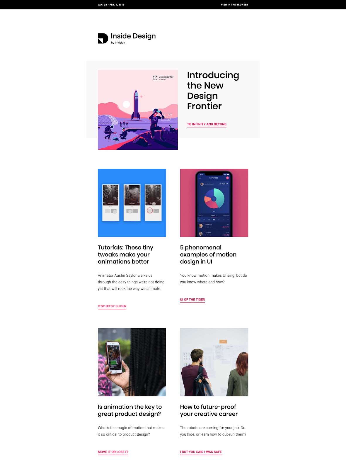
Sounds like a simple formula? All you need to do is link to blog content, right? Well, not exactly. The special ingredient in InVision’s recipe for email success is actually the quality of its blog content. Blog posts are contributed by people in the design community, with editing help from InVision staff.
As InVision’s former VP of Marketing Clair Byrd explains, InVision’s strategy on the blog “has never been to be about InVision, but instead, to represent an accurate cross-section of what the design community cares about at any given point in time.”
It’s this authenticity that is reflected in the weekly email newsletter. When subscribers click through to the blog, they know they’re going to read something insightful and valuable.
2. Use concise, descriptive and engaging link text
Don’t use “click here” as link text. Aside from the fact it tells the subscriber nothing about the value of the link, 46% of email opens are on mobile compared to just 21% on desktop. So most of your subscribers are actually tapping, not clicking.
According to the World Wide Web Consortium (W3C), when linking text, you should use brief but meaningful link text that:
- Provides some information when read out of context,
- Explains what the link offers,
- Doesn’t talk about mechanics, and
- Is not a verb phrase.
For example, you want to avoid the following sentence and link in your email:
To read Jack’s latest blog post, click here.
Or:
To read Jack’s latest blog post, go to the MailPoet website and navigate to the blog.
Both of these sentences divulge too much of the mechanics of getting to Jack’s blog post. Instead, use something short and sweet like:
Read Jack’s latest post.
Notice that “read” is left out of the link because W3C doesn’t recommend putting verb phrases in linked text.
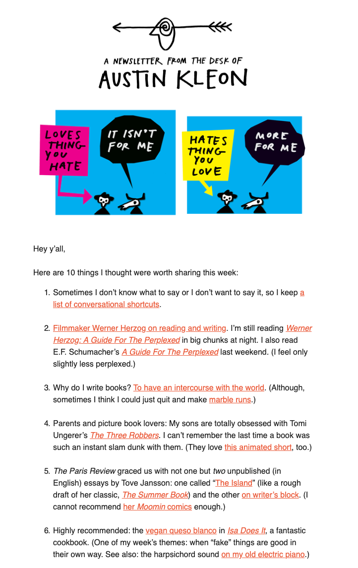
Author Austin Kleon nails his link text, which you’d expect of a writer! Each of his links provides some information when read out of context, is descriptive so you know what the link offers, and doesn’t go into mechanics. As a result, his email is concise, informative, and engaging.
Above all, you want to use descriptive text that tells the reader where they are going. Your readers’ eyes will be automatically drawn to your links, so many sure they are engaging.
Don’t make the subscriber question what will happen when they click/tap your link. If you’re vague or confusing, you’ll lose the subscriber’s trust.
Note: If you are writing text for a CTA, the rules are a bit different and should be action-oriented. We’ll explore this later in the post.
3. Links should go where they say they are going to go
This seems obvious, but how many times have you clicked/tapped a link and landed on a page you weren’t expecting?
Make sure your link text accurately describes where the link is going so as not to confuse subscribers. If people think you are tricking them into visiting a page, you’ll immediately lose their trust. In a worst-case scenario, they might even feel compelled to unsubscribe from your email list.
Also, don’t forget to verify all your links work before sending out your email! There’s nothing worse than sending out an email to thousands of subscribers and discovering later that one of your links had a typo, linked to a 404, or linked subscribers to the wrong website.
4. Links should help your subscribers save time
Links should allow your subscribers to save time when reading an email and let them choose what they would like to read more about, without distracting from the primary goal of the email.
For example, say you’re announcing a product launch to your email list. Rather than include every little detail about your new product in your email, write up your announcement as a blog post and link to it in your email with a clear call-to-action. Your email can then highlight the most important features of your product, and you can include links to pages that provide more detailed information.
You don’t want to cram too much information into your emails. When using links in emails, keep them short and concise so they’re easy to read and so subscribers feel compelled to click your links to find out more.
5. Consider how you design your email text links
Links should be easy to identify and clearly labeled. While most people will automatically recognize standard text links in personal emails that are blue and underlined, you’ll want to make sure that your links match the colors of your brand and email design.
Here are some tips to keep in mind when changing the color and style of your email links:
- Use a color that complements and contrasts the color of your non-linked paragraph text. For example, if your business logo is orange and your paragraph text is black, use orange for your text links.
- Use the same font and size as your paragraph text.
- Consider underlining your links for instant link recognition. Tip: Don’t underline text that isn’t a link. That’s why underlining was removed in MailPoet’s designer!
- Once you’ve chosen the color, font, and size for your links, keep it consistent throughout your email. Using different colors and styles for your links will confuse your readers.
A great example of color and design done well in an email is the weekly Really Good Emails newsletter. The RGE primary branding color is red, so this is the color used for text links throughout the email. The only exception is the small text underneath the header image, which is grey and underlined.

When you open the RGE newsletter, you know exactly what is a link and what is regular text — there’s no room for confusion because the design is consistent.
Bonus: Use images or buttons for important calls-to-action
If you’re really looking to push something in your email, consider linking an image or button rather than text. When used strategically, image and button links will grab a subscriber’s attention more quickly than text links.
Any image in your email newsletters can be turned into a clickable/tappable link. But image links often aren’t as obvious as text and button links. So if you’re including an image link, make it obvious. Add text to the image, or include text underneath to indicate that it’s a featured image for a blog post.
Buttons are a common way to display calls-to-action. Use strong, actionable verbs, like “Buy Now” or “Shop Now” or “Get the App.” Using the word “now” in your CTA will subconsciously prompt the user to take action immediately rather than putting it off until later, or even forgetting about it entirely.
Here’s a great example of how images and buttons can be used effectively in an email. Video hosting platform Wistia’s email newsletter offers a round-up of its featured posts. Images and post titles are linked, and there’s a big blue CTA underneath the top post. Using the words “Let’s see,” it’s pretty obvious that when you click/tap the CTA, you’re going to be taken to the post.
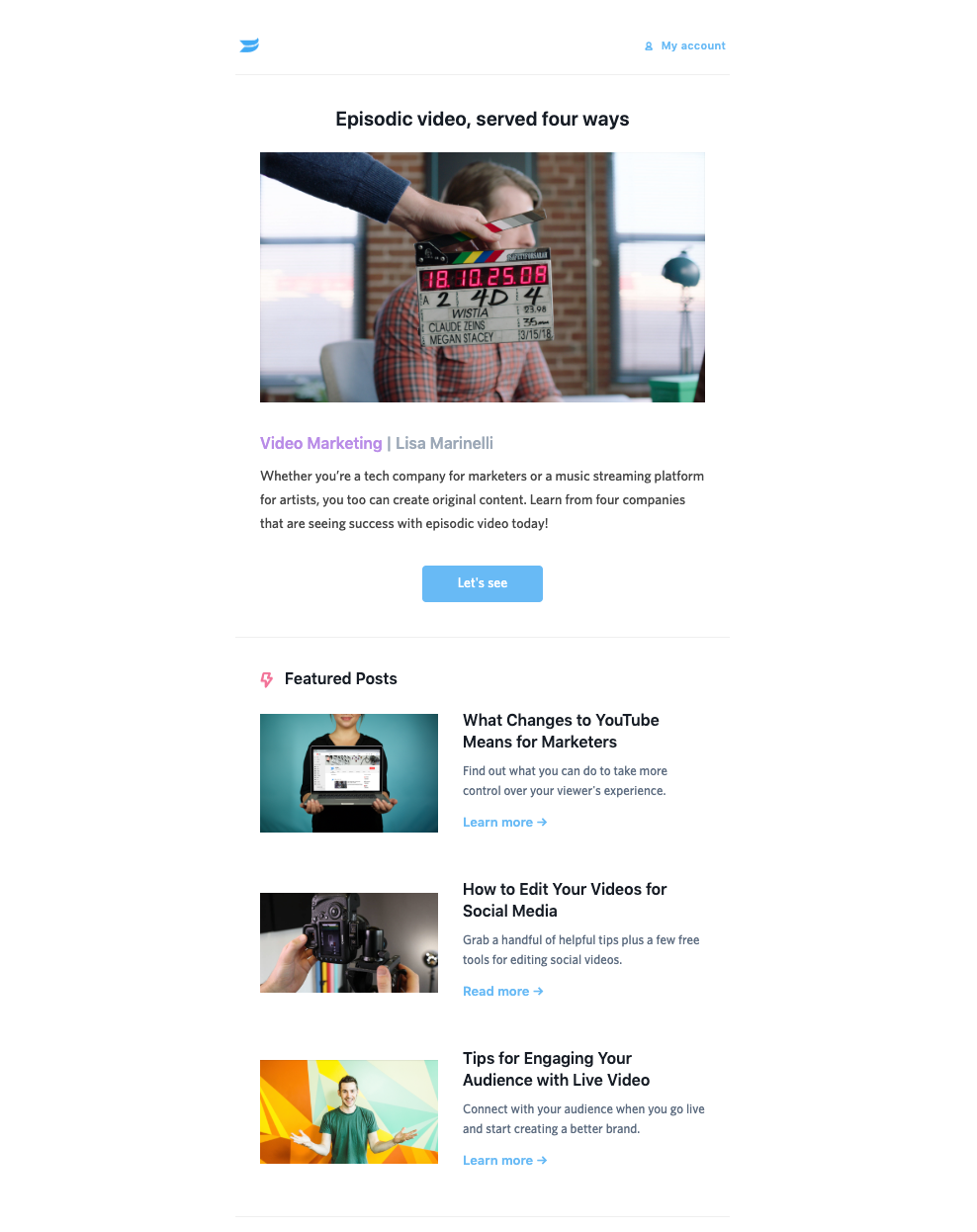
What’s great about linking images and text for blog posts is that you’ve giving subscribers more opportunities to access your content. People typically just know that when you click/tap an email next to a post title or headline in an email, that it’s going to be linked.
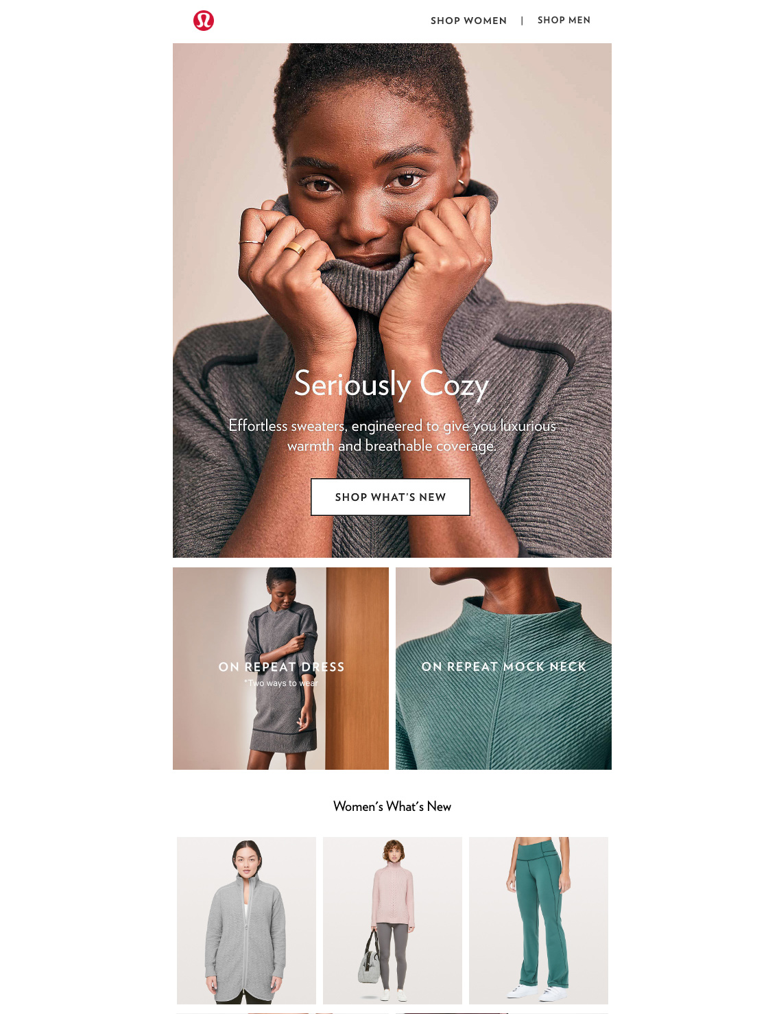
Here’s another example from activewear brand Lululemon. Each of the images is linked, and some images are overlayed with text. This email is simple and intuitive, and even similar to the shopping experience on the Lululemon website.
Track your clicked/tapped links with MailPoet
Now that you know how to write and design your links, you’ll want to know how effective your efforts are in improving your click-through rates. With MailPoet, you can get helpful statistics that provide an overview of your open and click-through rates for each of your email campaigns.
With a paid MailPoet plan, you can access more advanced statistics, including overall clicks per newsletter and a breakdown for individual links. You can also create campaign tags and track them with Google Analytics.

Wrapping up
At the risk of stating the obvious, more people are going to click your email links if they are easy to see and easy to understand. If you try to trick the reader into clicking a link or you overstate what the link offers, subscribers will feel cheated.
Design plays a big part in how subscribers not only view your emails, but how they perceive your business or organization. So taking the time to make sure your links look good will not only encourage more people to click your links, but will reflect on your brand and the value your offer.
With MailPoet, you don’t have to worry too much about your design! No matter which email template you choose, you can be confident all MailPoet templates follow email design — and link! — best practice.
Got a question about writing for formatting your email links? Let us know in the comments below!


Discussion