
“Simplicity is the ultimate sophistication.” So said Leonardo da Vinci over 500 years ago in Renaissance Italy. Clearly, he wasn’t talking about email marketing (although he did predict many other future technologies!) Nonetheless, we can still apply his wisdom to the contemporary “art” of writing awesome email content.
In this post, we’re going to discuss simplifying your emails to their core parts. We’ve talked before about the importance of keeping your content concise. But in this post, we’ll talk about simple text emails.
To help us explain the advantages of simple text emails, we talked to Val Geisler, an email marketing conversion copywriter and strategist. Val is a big fan of the simple text email:
While beautifully designed email templates do have their place (and look oh-so-pretty in a designer’s portfolio), there’s nothing quite like the power of a text-based email.
Val Geisler
What is a simple text email?
A simple text email, put simply, is just an email with little-or-no HTML. That means few or no images, no rich-text formatting, very few embedded links or Calls-to-Action, and so on. Simple text emails are essentially the digital equivalent to a plain, hand-written letter.
Technically, a “plain text email” has zero HTML, period. However, in practice, this can be a little excessive. Most of the benefits of a plain text email can be gained by simply reducing the amount of HTML in the email, rather than removing it entirely.

The advantages of simple text emails
At this point, you may be wondering: why use Simple Text emails? They sound pretty…neutered. However, they are actually incredibly powerful. Let’s talk about why.
1. A personal touch
The primary advantage of simple text emails is that they’re more personal. Indeed, in a world filled with flashing, fancy, corporate-speak emails, a plain text email is a welcome relief.
Emailing your list should feel like emailing a friend. Ya know, the emails you actually read. Looking through my own inbox I have a few sales emails from big box stores, a reminder about my student loan payment (ugh), and an email from my sister with the subject: pie recipe. Guess which one I’m gonna read?
Val Geisler
Somewhere along the line, companies forgot how to talk like people. When you send a simple text email, it is essentially the same thing as sending an email directly from Gmail, Yahoo, or a similar email client. It simply feels more real. If your business depends on making a connection with your readers (and we bet it does!) avoiding an overly-designed email is extremely effective.
2. Simplicity
These days, virtually every company sends long, complicated emails on a regular basis. It can get exhausting, even for us, a company that sends emails.
You send your emails so that people will actually get them and read them. The more stuff you try and cram in with formatting, tables, and even a lot of images, the more likely it isn’t going to make it through to the inbox, or arrive the way you want it to.
Val Geisler
When in doubt, keep it simple. Your readers are probably just as busy as you.
3. Spam filters prefer them
HTML-only emails are a no-go, according to spam filters. Indeed, not including a plain text version of an email is a strong sign that your email will go to spam. Why? Because most legitimate senders include it.
HTML-only emails are a red flag for spam filters. A lazy spammer wouldn’t take time to create a plain-text alternative so make sure you do!
Litmus
Spam filters also don’t like emails that have a low text-to-image ratio. That is, if you have a ton of images but not very much text, you’re in trouble.
However, the MailPoet doesn’t have these issues because we always send both versions to your subscribers. The plain text version isn’t visible unless you view the original code of the email.
4. Stuff loads faster
Even in 2018, it’s important to remember that not everyone has a super-fast Internet connection 24/7. Emails with images take longer to load, use more data, and generally just waste more time.
This is especially true if you have five or more images in your email. Image-heavy newsletters can often be over 5MB in size. Contrarily, a simple text email is rarely over 50KB.
5. Universal design across all devices
Chances are, your readers will view your email on a mobile device. Images, fancy layouts, and other complex HTML editing typically don’t translate well to phones or tablets.
Mobile matters. Industry reports show anywhere from 45% to 66% of emails are opened on mobile devices. On mobile, imagery is hard to see and tables and columns in emails don’t translate reliably. The only true way to get the same rendering of your email from device to device is to keep it text-based.
Val Geisler
In MailPoet, this isn’t a problem, as all of our templates are responsive and hand-crafted to look good on all devices. As such, you don’t need to worry about it.
So, if you want to keep your email looking the same across all devices (and save yourself a ton of time, to boot) use MailPoet’s responsive templates. Otherwise, stick with simple text.
6. Avoid unexpected niche issues
There are many specific niche audiences that have problems (technical or otherwise) with viewing image-heavy rich HTML emails. For example:
- Older email clients like Microsoft Outlook often have issues displaying images. Yep, even in 2018.
- For security reasons, many government and military organizations block HTML emails by default. If your audience includes such users, sticking to simple text is likely safer.
- Users with disabilities have a harder time reading emails that have a ton of images. This is often an issue with infographics and other information-rich images. If you absolutely must include images, always be sure to write detailed alternative (ALT) text.

The disadvantages
Of course, not everything is all roses. There are some definite disadvantages to using simple text emails.
1. No images, no colors
If your business or website is very image-heavy, simple text emails can seem counter-intuitive. However, the ultimate goal is to get users on your website – not in their email client. As such, the lack of images isn’t as a big of a deal as it may seem:
Your website is where you want them to go anyways. Use your emails to get your potential customers to your website. Once they’re there you can wow them with your images, engage them with your videos, and make them LOL with your GIFs. After all, it’s your website (or sales platform) that actually makes you money – why wouldn’t you want them to end up there anyways?
Val Geisler
Customers can’t buy a product directly in your email – they need to visit your website. As such, your main goal should be getting them there!
2. Lack of “modernity”
It’s 2018 and most corporate emails are well-designed, full of images, and use the latest email marketing technology and techniques. Unfortunately, this means that a simple text email can seem “outdated” for lack of a better word.
There is really no avoiding this – however, it can actually end up being a good thing. Customers don’t expect businesses to send simple, friendly emails, so when you avoid using an image-heavy, polished email template, you actually stand out.
3. Less branding
By default, a simple text email lacks color, design, and other brand-heavy elements. If your brand relies on strong colors, big images, and other designed elements, you may have some issues with simple text.
You can avoid this issue by including a small image of your logo at the top of this email. This way, your brand is still present and communicated.

Sending simple text emails with MailPoet
Sending simple text emails in MailPoet is super-easy. Simply choose the Simple Text template on the Select a responsive template page.

As you can see in the template, there are still a few minor HTML elements:
- Simple logo header image
- Bold header text
- One call-to-action button
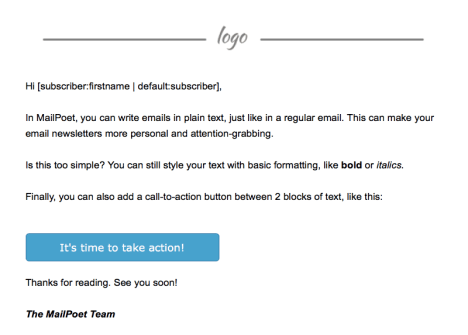
This is a good compromise. Since we only have one item with color (our CTA button) it’s much more likely to be clicked on!
Here’s what a “simple text” email can end up looking like:

Of course, our font choice and overall style are design choices, intended to highlight the “plain text” nature. You can still send simple text emails and use regular fonts.

Final tips and tricks
-
- Make sure your writing is perfect. In simple text emails, there aren’t any fancy images to distract readers from the content. If your content is sub-par and you rely on flashy images, you’re in trouble.
- Emojis are considered text, not images, so feel free to use them.
- Don’t paste your link directly in your emails: https://www.yahoo.com. Add your links to text, like this: Visit Yahoo.
- Keep paragraphs short to optimize for readability. Vertical whitespace is important!
- Likewise, be creative with how you separate content. Since you can’t divide content with images, try ordered lists (OL) or unordered lists (UL) instead.
Illustrations by Natalie Bizarreamie.


Discussion