
The best email design in the world won’t do you any good if you don’t have any subscribers. This makes it essential to create a variety of email signup forms.
Pop-ups, slide-ins, and fixed bar forms should all be part of your lead generation strategy.
In this guide, I will walk you through the basics of creating successful email signup forms:
- What they are
- Signup form best practices
- Things to avoid
- Tools you can use to create email signup forms
- How to create an email signup form with MailPoet
By the time you’re finished with this article, you’ll be armed with the strategies and tools you need to get website visitors onto your email list.
What are email signup forms?
Email signup forms are the forms used to gather email addresses and other basic information about potential leads. Every email marketing service provides built-in form building capability. There are also specialized lead generation programs like OptinMonster.
Types of email signup forms
There are four main types of lead generation forms: embedded forms, pop-ups, slide-ins, and fixed bar forms. They all have the same goal—to get you more email subscribers—but they accomplish it in different ways.
Embedded forms
If you’re collecting subscribers already, you’re probably doing it through an embedded form. These email signup forms are coded directly into the layout of your website, like this signup form on my Business for Authors site:

You can choose to keep an embedded signup form on one page of your site or to put it in your header and/or footer so it shows up on every page.
When to use this form type: On a newsletter landing page or any other page explicitly advertising your newsletter. Embedded forms can also be placed at the ends of blog posts. After all, if a reader finished your article, they’re probably interested in hearing more from you.
Pop-up forms
Pop-up forms have long been the most controversial type of email signup form because of their intrusive nature.
In the past, pop-up forms opened as a separate browser window. Modern browsers don’t allow for this, so pop-up forms now appear as an overlay that covers your content, like this pop-up on Blogging Wizard:

Users are then forced to enter their email or close the pop-up if they want to continue reading your content.
Pop-ups can be annoying, but they are also effective. According to Modern Marketing Partners, pop-ups have a success rate of 3%. This seems insignificant until you consider that it’s three times higher than the success rate of a passive signup form at the end of your content.
Today’s pop-ups can also be given custom triggers. For example, you can program a pop-up form to appear when people have scrolled down a certain percentage of a given page. This allows you to make your ask after you’ve provided value to your audience, making them more open to it.
When to use this type of form: Pop-ups are the most intrusive email signup forms, so you want to display them to an audience who already understands your value. This means setting your pop-up to appear when a visitor has interacted with your site in a certain way, such as having scrolled down 75% of a page.
Another good time to use pop-ups is when people attempt to navigate away from your website. According to Conversion Sciences, this strategy can “save”10-15% of “lost” visitors.
Slide-ins
Slide-ins are similar to pop-ups, appearing in front of your content so people can’t ignore them. The main difference is that they slide into view on your page. They’re also less obtrusive than pop-ups, as they’re smaller and don’t often appear in the center.
In fact, many appear as a small box at first, like this slide-in on the Sleeknote site:

The viewer can then choose to expand the form by clicking on it.

Slide-ins are programmed to appear when certain behavior is completed, such as scrolling down a certain amount of the page.
When to use this type of form: Like pop-ups, slide-ins are best used when your audience is already engaged. You want them to appear when someone has gotten far enough into your content to understand its value.
However, the less intrusive nature of these forms makes them less likely to be effective when people are attempting to leave your site.
Fixed bar forms
These email signup forms, also known as floating bar signup forms, are embedded in a small bar across the top of your site. This bar stays at the top of the page as your reader scrolls down, which is why it is considered “fixed”.
Fixed bar signup forms are great because they’re always visible to your audience. They’re also less intrusive than slide-in or pop-up forms.
This type of form isn’t only for email signups, either. Many sites like OptinMonster use a floating bar to encourage account creation:

When to use this type of signup form: Fixed bar forms should exist on any page where your viewer is likely to do a lot of scrolling. In fact, it’s not a bad idea to use a fixed bar form on every page of your site.
Email signup form best practices
1. Create a killer offer
Everybody’s inbox is crowded. In fact, people send and receive an average of 121 business emails per day. This makes them pretty reluctant to join new email lists. If you want their information, you’ll need to give them something they can’t refuse.
There are many different incentives you can offer new subscribers:
- Coupon for your products or services
- One free product or service
- Free trial of a product or service
- Access to an exclusive ebook or report
- Printable worksheets and/or workbooks
- Downloadable checklist
- Enrollment in a free email course
- Digital art (to be used as desktop or cell phone backgrounds)
- Access to a specialized resource library
- Exclusive video content
- Enrollment in a live webinar or other free training
Of course, these are only the most popular options. You can give subscribers anything that’s relevant to your business. For example, if you sell knitting supplies, you might offer a downloadable pattern for an easy knitting project.
The key to success with this strategy for email signup forms is to offer something with real value to your audience. Your offer should help them save money, give them the knowledge they need to solve a problem, or provide them with tools that can improve some aspect of their lives.
Many blogs do this by compiling their best content into an ebook. Another blog I write for, Revive.Social did this with their most useful articles about Instagram:

This method also gives your site a higher level of authority, since you now have a published book in the world.
2. Use multiple email signup forms
You want to give your audience multiple opportunities to subscribe as they explore your content. At the bare minimum, there should be a signup form at the top of the page and another one at the bottom.
One site that uses multiple email signup forms well is DIY MFA. There’s a signup bar directly above the fold asking you to “Join Today”:

Scroll down a bit further and you’ll see another signup form embedded in the sidebar. This form also contains more information about the signup gift offered to subscribers.

There’s also a slide-in form that appears if you reach the bottom of the page and start scrolling back up.

The variety and placement of these email signup forms ensures that visitors can easily subscribe to the DIY MFA newsletter at any point in their exploration of the site. When they decide they trust DIY MFA enough to share their email, they don’t need to scroll far to do so.
3. Craft the perfect call to action
The call to action is the “ask”, the moment you request that your audience takes an action, such as subscribing to your newsletter.
Successful calls to action share three characteristics:
- Clear wording
- A reference to why people want to take this action (in this case, to access your subscriber offer)
- Prominent placement
In other words, your audience should be unable to overlook or misinterpret the call to action.
Check out this signup form from the Live Write Thrive blog:

This form is great because it has three calls to action.
The first, “strategize your writing career”, reminds readers of why they came to the Live Write Thrive blog: they want to become successful authors.
The second sentence is also the second call to action. Here, you’re told to sign up for the newsletter in order to receive updates from CS Lakin and a free ebook. This is great because it outlines exactly what subscribers can expect.
The third call to action is the button at the bottom of the form. Instead of going for a generic phrase like “Join now” or “Subscribe”, the button says “Click here to get your free ebook”. This once again reminds viewers of the subscriber offer, and the wording is unambiguous.
4. Use a landing page
One of the most effective ways to market your newsletter is to create a landing page for it. This is an entire page of your website dedicated to promoting one aspect of your business, in this case, your newsletter.
Landing pages are essentially separate from your website, with no top menu connecting to other areas. This keeps your audience’s focus on the product or service you are trying to sell, or in this case, give them. You can place a sitemap at the bottom, but many landing pages only link to the signup page for the content they’re trying to sell.
You can include your signup form directly in the body of the landing page, as Microsoft has done with this webinar landing page:

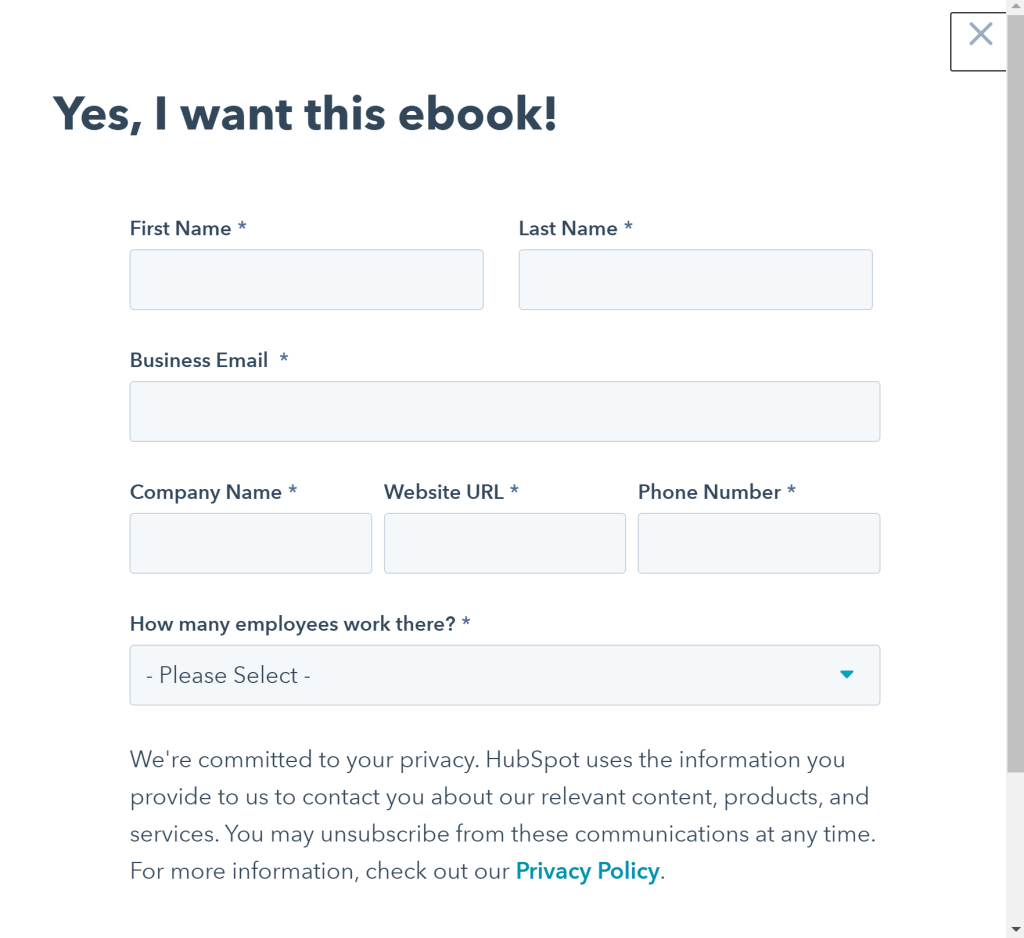
You can also create a popup form that opens when people click on a link or button. HubSpot has done this with their Business Networking Crash Course.

You can use a tool like Unbounce to build a landing page quickly and without using any code.
Once your landing page is created, market the heck out of it! Link to it in your social media and guest post bios, run ad campaigns for it, and ask subscribers who have enjoyed your content to share it too. Linking directly to this page instead of, say, the home page of your website, is a great way to ensure that viewers’ attention is directed to your email list.
5. Use social proof
You can talk about your own brand until you’re blue in the face, but it will never be as effective as sharing a one-sentence testimonial from your customers.
How to get social proof for your email list
When it comes to a signup form, there are two things you want to demonstrate social proof for: your signup offer and the content of your newsletter itself.
You can ask for feedback in any newsletter, but the best strategy is to create automated emails requesting testimonials at specific times. For example, if you want to get testimonials about your signup offer, you can set up an email to send two weeks after signup.
Make sure your emails are 100% clear about the type of feedback you’re looking for and what you plan to use it for. You may also want to offer an incentive, such as a 10% off coupon for your store, to encourage more people to respond.
How to use social proof in email signup forms
Social proof can be used in a variety of ways depending on the type of form you’re working with:
- Pop-up forms give you enough space to feature multiple one-sentence testimonials or one longer review.
- Slide-ins offer the right amount of space to feature a single one-sentence testimonial along with your pitch.
- Landing pages are a great place to share your entire collection of testimonials.
Some email marketing tools also let you show a subscriber count in your signup forms. This isn’t helpful when you’re first starting out, but boasting 1,000 or 5,000 or an even higher subscriber number makes you appear more legitimate. If you have a good number of subscribers, this is a great way to spruce up embedded and fixed bar forms.
6. Use a double opt-in
Raw numbers aren’t as important as having a clean email list. Bots and uninterested users increase your email bounce rate, which increases your chances of being marked as spam or even kicked off of your email marketing service.
Double opt-ins help you avoid these problems by confirming your audience’s interest twice: once in the form itself and once in an email. Even better, most email marketing tools let you enable a double opt-in with a simple checkbox during the form creation process.
7. Test, test, test
Best practices are important, but every audience is different. To really know what works for your audience, you need to test everything. Try different calls to action. Experiment with a variety of offers. Change the placement of your embedded forms. Alter when your pop-ups or slide-ins appear.
However, you don’t want to make these changes on a whim. The key to successful testing is a methodical approach. You want to change one element of one form and leave it in place for several weeks, tracking changes in the subscriber rate on that signup form. You also want to pay attention to demographics trends that might suggest a shift in your audience.
Most email marketing tools track the number of signups each form receives. MailPoet users can find this information in the “Forms” area of the plugin:

Demographics, however, are not usually displayed in the signup form analytics. To figure these out, you’ll need to do a little extrapolation based on the overall demographics of your list and the percentage of new subscribers gained from a particular form.
If you want a tool that offers detailed analytics on individual signup forms, consider a lead generation plugin like OptinMonster.
A/B testing
A/B testing displays the original version of a piece of content to a portion of your audience (usually around 50%) and a modified version to the rest. You can then track the success of each version to determine which is most effective. This is an incredibly efficient way to gather data, but it is not available through all email marketing services.
Things to avoid
There are several common mistakes people make when designing email signup forms:
- Asking for too much information – Every required information field creates more work for your audience. Keep things simple by only requiring an email address and maybe a name. (Some exceptions may apply, such as retail outlets requiring location information so they can send users local sales.)
- Hiding the signup form in the footer – By this, I mean having the only signup form in your footer. This does put the form on every page, but it also means people who don’t scroll down the whole way won’t see it. If a blog post gets a lot of comments, it will effectively make the signup form invisible.
- Using a bad color scheme – Your email signup forms should match your site aesthetically and be easy to look at. Be careful with contrasting colors, especially font colors.
- Making the font too small – Small fonts are hard to read on mobile screens and inaccessible to people with visual impairments. Use at least 16pt font.
Tools for creating email signup forms
There are two main options for creating newsletter signup forms: email marketing tools and lead generation tools.
Email marketing tools are the programs used to send email marketing campaigns, such as MailPoet. These tools usually offer visual drag-and-drop signup form editors and access to some form templates. Some of these tools are only capable of creating certain types of forms and/or lack advanced settings like timed pop ups.
MailPoet’s form builder, which I’ll take a closer look at in the next section, lets you create pop-ups, slide-ins, fixed bar forms, bottom-of-page forms, and signup widgets that can be embedded anywhere. The plugin also features a large collection of form templates created by professional designers.
Lead generation tools like OptinMonster are specialized tools for creating signup forms and landing pages. These tools provide form template libraries, visual form builders, advanced analytics, and A/B testing.
Some lead generation tools, including OptinMonster, also offer advanced targeting features like Geo-Location Targeting. This makes it possible to create personalized signup forms for various demographics within your audience.
How to create email signup forms with MailPoet
Finally, let’s take a look at how to create lead generation forms in MailPoet. These step-by-step instructions are specific to the MailPoet plugin, but most signup form editors work in a similar fashion. Once you’ve mastered one, you can easily transition to another.
To get started, go to the “Forms” area of MailPoet and click the “+ New Form” button near the top of the page.

This will take you to a page where you can choose the type of form you want to create. You’re automatically set to “Pop-up”, and the first two templates are displayed above the fold.

Note that the “Widgets” option is what you’ll click if you want to create an embedded form.
Once you’ve chosen the type of form you want to create, you can view templates for that form type. MailPoet currently offers around a dozen templates for each type of signup form and is set to significantly expand their template library in the coming months.

Click the “Select” button in the box displaying your preferred template to open the form editor.

The MailPoet editor for email signup forms consists of two areas. On the left side is the visual editor, where the form is displayed. You can use the drag-and-drop functionality of this area to change the placement of content blocks.
The right side of the form editor is a sidebar where you can configure how your form works. This initially opens on a Settings area where you can edit the form title, what list(s) subscribers are added to, and the text displayed when somebody signs up.
To modify the form’s appearance, click “Styles” in the sidebar. This will open a menu allowing you to change a variety of settings:
- Background color and/or image
- Font family
- Font color and size
- Border color
- Success message color
- Error message color
- Close button style
This makes it easy to ensure that your form aesthetically matches your WordPress theme and brand aesthetic.

The next area of form settings is “Form Placement”. You can use this area to configure settings related to the form type. You can configure a single signup form to appear as several different form types. This makes it easy to use the same copy and settings for multiple form types but will complicate things when it comes to tracking the success of each form type.

When you choose a form type, you’ll be prompted to enable those form settings. You’ll then be given the option to adjust settings like form size, what pages the form appears on, and how many seconds must pass before the form appears. Pop ups can also be set to appear when someone attempts to leave your page.

To add content blocks to your form, click the “+” button at the top of the editor. A dropdown menu will appear, displaying the types of blocks you can use. MailPoet lets you add text, images, lists, custom HTML, and custom information fields.

There is no limit to the number of blocks you can add, but a brief signup form is always better.
You can edit the content of an individual block at any time by clicking on it. The settings for that particular block will appear in the right sidebar.

When you’re satisfied with the appearance of your form, click “Save” to publish it. Note that you must assign the form to a list in order to save it.
Final thoughts on email signup forms
The most carefully thought out email campaign in the world can’t make up for poorly designed newsletter signup forms. If you want to grow your email list, you need to be strategic in how you use email signup forms:
- Use multiple form types, including pop-ups, slide-ins, and fixed bar forms
- Take advantage of unique features offered by certain form types, like the option to make pop-ups appear when visitors try to leave your site
- Create a subscriber offer that your visitors can’t pass up
- Build a landing page and market it relentlessly
- Use social proof in forms and especially on your landing page
- Use a double opt-in to encourage list cleanliness
- Test everything you do; use A/B testing when possible.
These best practices will help you turn your hard-earned website visitors into subscribers.
Have you tried the MailPoet form editor yet? Sign up for a free plan.


