
As a modern business owner, you know it’s essential to have an online presence and a strong email list. But have you ever considered what your email marketing campaigns look like on mobile devices?
If the answer is no, you’re missing out on a huge opportunity. This guide will help you understand mobile ecommerce email marketing: what it is, why it matters, and how to do it effectively.
You’re already doing mobile ecommerce email marketing
61.9% of all emails are opened on mobile devices. This means that if you’ve ever sent an email marketing campaign for a product, you’ve probably participated in mobile ecommerce email marketing. In fact, there’s a good chance that most people reading your emails are doing so on their phones or tablets.
When you combine this with the fact that 80% of those users immediately delete emails that aren’t mobile-responsive, it becomes clear that you need to get intentional about optimizing your campaigns for mobile devices.
The stats for mobile ecommerce are even more impressive. 82% of mobile device owners in the US have used their device to shop online and mobile shoppers spend twice as much as other customers.
And these trends are only going to grow: by 2025, 72% of users will only access the internet through mobile devices. If you want to build a lasting business, you need to make sure your marketing campaigns are optimized for mobile devices.
How to determine what percentage of your audience is mobile
The statistics are interesting, but how does this actually reflect on your business? Well, you can find this information in a couple of places:
- Google Analytics. You can use Google Analytics to find out what percentage of your website visitors are mobile and the precise number of mobile visitors you have each day. You can even view some information about the types of devices they’re using.
- MailPoet. MailPoet offers integration with Google Analytics (paid plans only), which must be enabled on individual campaigns. If you have enabled this feature, you will be able to see the percentage of people who are opening your emails from mobile devices.
This is a great way to learn more about your current audience, but remember that even if the number is small now, it is sure to grow as more people go mobile-only.
How to make sure your ecommerce email campaigns are mobile friendly
There are five strategies you can use to make sure your ecommerce email marketing campaigns are responsive.
1. Use a mobile-optimized template
One of the easiest ways to make sure your emails are mobile-friendly is to use a responsive template. MailPoet offers a variety of responsive templates for members, including specialized templates for WooCommerce emails.

If you’re not using MailPoet or you fancy creating your own templates, you should use an email testing tool that can determine your template’s compatibility with a variety of devices. Here at MailPoet, we recommend Litmus.
2. Write a short subject line
The desktop display of most email clients shows around 60 characters in the subject line, but on mobile, you only have room for 25-30 characters. This means you need to get your point across fast. For maximum effectiveness, consider using an email subject line style known for improved open rates.
3. Stick with a one column layout
Layouts with multiple columns are difficult to read on small screens. Choose a single column template whenever possible. If you absolutely must use a two column layout, keep the text on the left side.
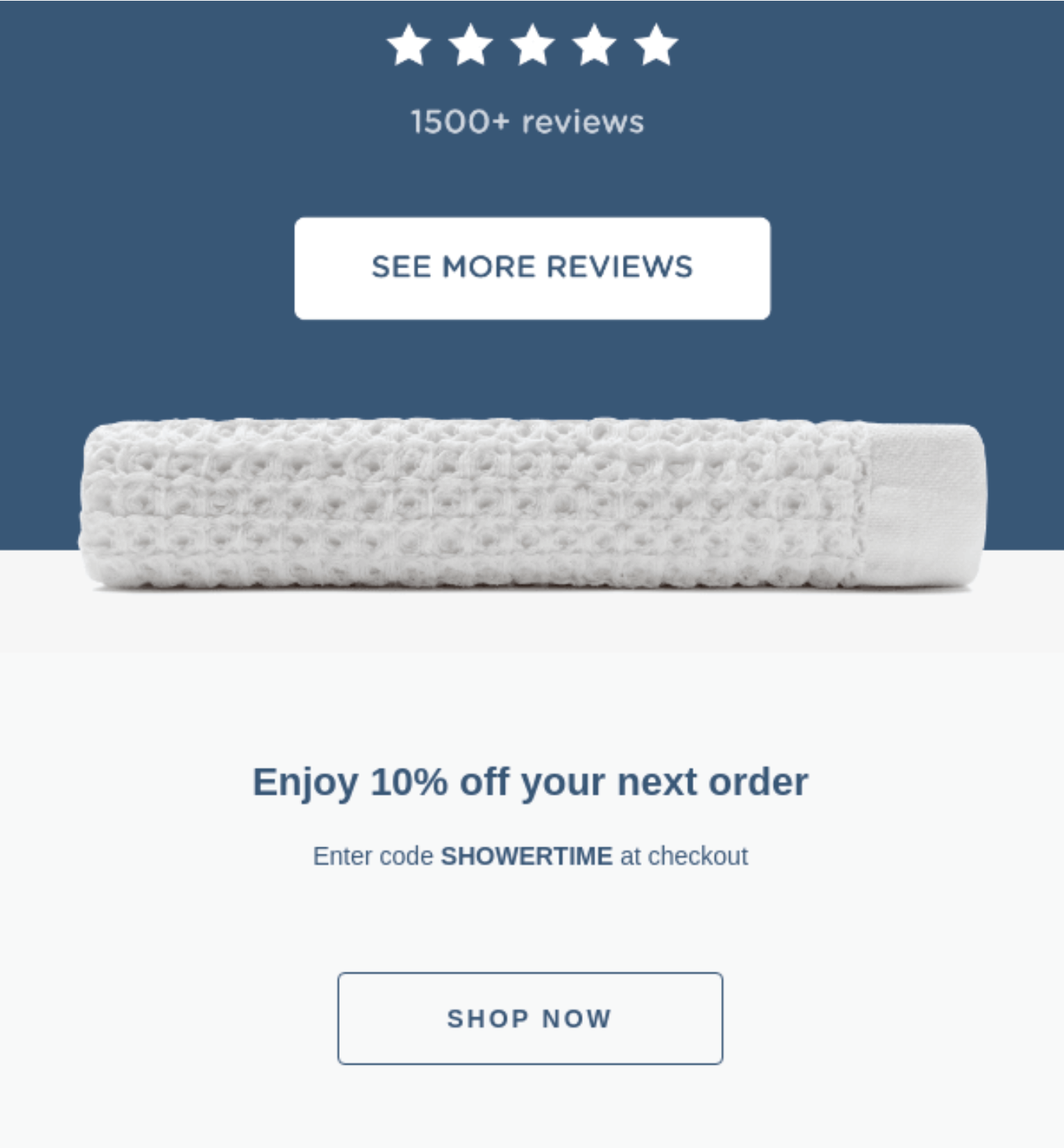
Onsen does this well, using their single column to feature striking imagery and prominent testimonials.

This quote compels viewers to scroll further down in the email, where they can look at reviews or access a 10% discount.
4. Use a large font
Small text on a small screen is a nightmare to read. Your font should be at least 14px. This will also make your email more accessible to elderly and visually impaired folks.
5. Keep it short
The shorter an email is, the easier it is to read on a mobile device. In fact, the ideal length for email copy is between 50 and 125 words. Look for the shortest, most direct way to convey the value of your product or offer.
This ad for the Bell Lap Top by Tracksmith does an impressive job of conveying the value of their produce in just a handful of words:

6. Keep images small
Mobile phones often use slower connections, which means that large images take a long time to load. Many users also have data limits. A good rule of thumb is to shrink the image you plan to use by 50% and compress it at a slightly higher compression rate. This saves both time and data.
7. Increase white space
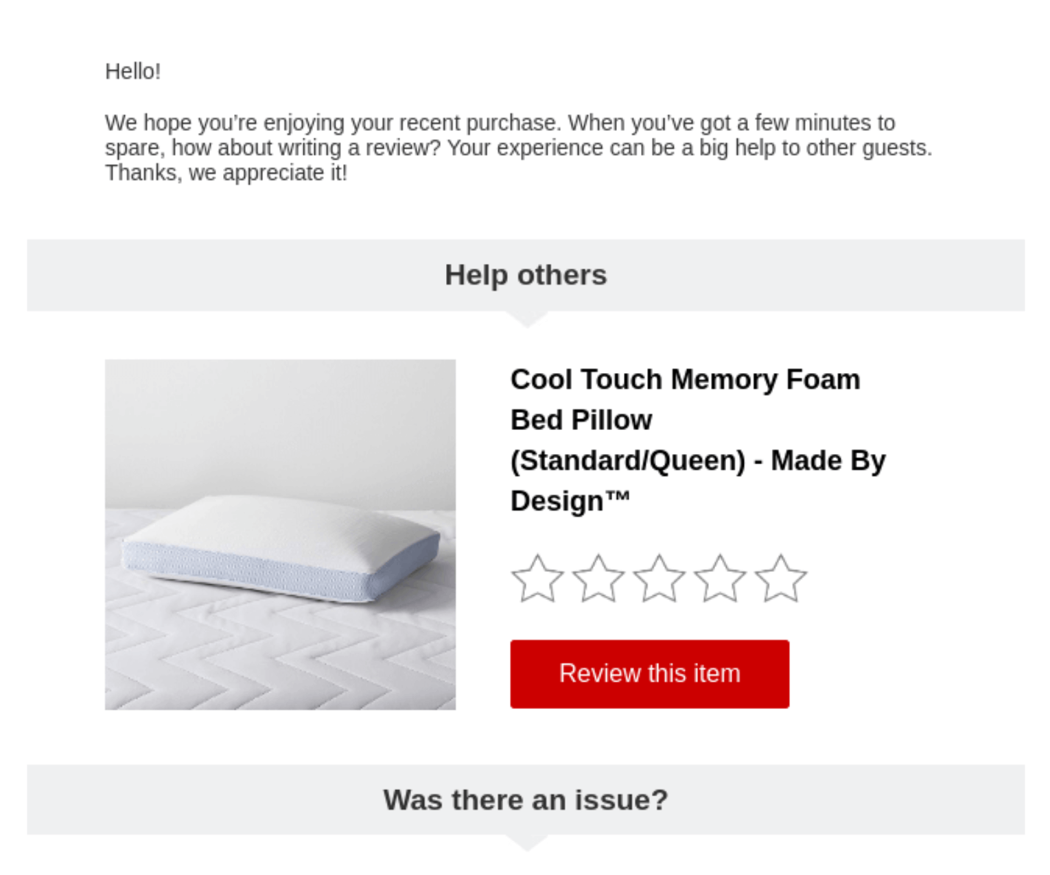
One danger of viewing content on a small screen is that it often appears cluttered. You can use white space to minimize this. Increase the margins of your email, add extra spacing between lines and paragraphs, and leave space between images and text. This will make it easier for viewers to understand where they’re supposed to look.
For an example of what this might look like in practice, take a look at this email from Target:
8. Use buttons instead of hyperlinks
Pressing a button is far easier than trying to click on a hyperlink embedded within text when you’re using a touch screen. To make this even easier, always ensure that your buttons are at least 46px wide.
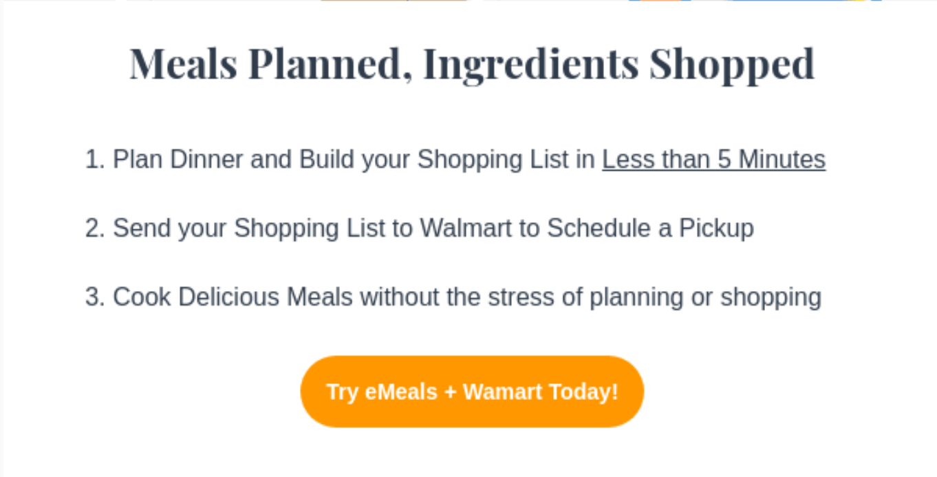
Emeals does a great job of this, including buttons at both the top and the bottom of their emails.

9. Avoid menu bars
Like hyperlinks embedded within a paragraph, menu bars are difficult to navigate with your thumbs. They also often necessitate a second column or small text, which make them difficult for mobile viewers to read in the first place. And, if we’re being honest, most of the time they only serve to detract from the main point of an email anyway!
10. Test your email on multiple devices
Finally, the best way to ensure that an email works on mobile devices is to test it on as many of those devices as possible. You don’t need to own multiple devices to do this. Instead, you can use a tool like Litmus to automatically test what your emails will look like in over 90 email clients. The process is simple:
- Sign up for Litmus. Litmus is a paid service, but you can sign up for a free trial.
- Add HTML code. You can use the Litmus email designer or copy+paste the code of an email created elsewhere.
- Wait for Litmus to do its thing. Litmus will send your email to over 1600 machines. Each machine will automatically open your email and provide a screenshot.
- Examine your screenshots. You will receive screenshots of what your email looks like in over 90 email clients. Do a quick scroll to make sure they’re all functional, and you’re ready to go!
Bonus tip: make the destination mobile friendly
Remember that your email is only meant to be the beginning of your audience’s journey. Whether you’re sending them to your ecommerce store’s home page or a specific product page, you need to make sure it looks good on their device.
The good news here is that most WordPress themes are already responsive. You can also use many of the strategies for making emails mobile friendly to improve the mobile experience on your website. Use large text, maximize white space, keep images to a reasonable size, and use touch-friendly buttons for your calls to action.
Final thoughts on mobile ecommerce email marketing
When it comes to mobile, the future is now. If you want your business to grow, you need to understand how to make your emails work well on mobile devices. The strategies in this guide, along with a comprehensive understanding of WooCommerce email strategies, will help you build profitable relationships with people on mobile devices for years to come.


All the tips are awesome and actionable. thanks for sharing this article with I am surely going to try them for my projects.