
In this series, we’re going to show you how to improve your email signup process and make it 100% more awesome. Want to know how to hack your MailPoet signup confirmation? We’ll show you how in Part 1…
Why should I change the look of my signup process?
In MailPoet, the first email your subscribers receive is the signup email. It’s the first point of contact they have, so you need to make an impact, and get as many people clicking through to confirm their email address as possible.
MailPoet lets you customize the subject line and content of that confirmation email, but did you know you can also hack it to add HTML? For instance, you might want to customize the font or make the confirmation link a bit more attractive by turning it into a button. It’s pretty simple!
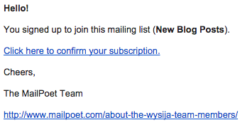
Here’s how our signup confirmation email started out:
And here’s how it ended up:

How to edit this email
If you aren’t confident with code, then we’d advise you not to play with HTML in these emails!
You’ll find the editing box in MailPoet->Settings->Sign Up Confirmation (tab).
Writing first, design second
It’s a good idea to think about the copy first, before you add any styling. The key to a good confirmation email is to keep it direct, and ensure that the recipient does what you want them to do: click the subscribe link.
I just switched ours up a bit with a couple of minor tweaks to the copy and got rid of the link to our team page below our signoff (which isn’t necessary here) – it just detracts attention from the key objective.
I also decided to reinforce that they won’t receive any newsletters until they’ve confirmed, since I think the less tech-savvy people might not realise this!
Finally I added a message to ignore the email if they’ve received it but didn’t sign up. Part of the reason for double opt-in is to confirm that the email address given was handed over in good faith (i.e. not signed up maliciously by someone). Having this additional step ensures that the emails we send are wanted.
Button = action
I wrote a while back about how to get people clicking on your links, so I’ve made the subscription link commanding, short and easy-to-read. A text link, “Click here to confirm your subscription”, now becomes a button “Confirm your Subscription”.
Design
I’ve kept the design of our email quite simple, adding a heading, some font styling and of course, the button appearance to that subscribe link.
Here’s the code we pasted into the ‘Email Content’ box found in the Sign-up Confirmation tab:

You can find a copy and paste-able version of this in Gist so that you can copy our styling and made the necessary modifications to it like colors, fonts, and image header etc.
And here’s where you might want to change things:

In order of appearance, here’s what we changed:
- red = the color of the background (needs changing in both places to make it work properly)
- light blue = the color of the newsletter body
- black = the URL that the header clicks through to
- orange = the header image URL, dimensions and the alt tag (if the image isn’t downloaded)
- pink = the font color
- purple = font face, the first one is the most likely to be seen
- green = the font size
- grey = the font color used in the button
- yellow = the button background color
- lime green = font face used in the button
- dark blue = font size used in the button
Need to get some colors for your email? Try this color picker.
Want to do your own thing? Sure, here’s some things you need to know:
- Since the [activation_link] contains the anchor tag, the only way to style the link without editing the plugin is to add a span tag inside it.
- If you line break your code, it will automatically add <br> tags for you, which isn’t acceptable between <head> and <body> tags for example, so you’ll need to put all of these on one line as shown above. You’ll also need to consider this when adding your own line break tags.
- Don’t forget that if you want to add a header image, it’ll need to be in your media library or hosted online and you’ll need to get the URL.
It’s a good idea to check it by signing up to your own form!
In Part 2 we’ll discuss the signup confirmation page, and in Part 3 we take a look at the signup confirmation welcome email.


When will be be able to edit the confirmation email that goes to the admin to include more of the subscriber fields? Just the email is not enough. Option to add selected or all fields on the signup form would be great. Thanks.
Hello Micahel, good point. We’ve added it to our list on enhancement for the future.
Alternatively for now, you can always use a Gravity Forms (premium plugin), and connect it with MailPoet.
This way, you’ll get a notification email with all the fields from Gravity Forms.
Take a look in the code example line 7 ffffff”>
Seems something are missing?
Sorry it’s fixed now
Much better – works perfect now :-)
Thanks for the tips, looks great.
I’ve got a question more or less related to this: after signing up, there is a little yellow field announcing the confirmation email. Is it possible to edit this field, for instance changing the background color? (I tried just adding HTML, but that does not work.)
Or even better: to lead to a sort of landing page where subscribers may get information like on a landing page (“while waiting for the confirmation email, please check out our ….”)?
Hi Emmy,
Thanks for getting in touch!
To change the color of the field, you can need to edit the css in the following file in the plugin:
wp-content/plugins/wysija-newsletters/css/validationEngine.jquery.css
In the file, search for “.widget_wysija_cont .updated, .widget_wysija_cont .login .message” – there will be two results. Change the colors on the second result.
We have a file to redirect after form submission, I’ll email it to you now along with instructions on how to implement it.
Best wishes,
Becs
Hello Becs,
thank you for this useful tutorial, I believe too in the power of buttons!
To take customization one step further, is it possible to send different emails to people who suscribed to different lists?
I use different lists to manage subscriptions in different languages, and I would very much like to send a confirmation email in the subscriber’s language.
Otherwise the plugin is awsome.
Best regards,
Magalie
Hello Magalie, there is only one confirmation email, and there’s no possibility to have a second one.
Our recommendation is to write out all the different languages in your confirmation email. It usually does the trick.
Hello Kim, thank you for your suggestion. I will do that.
Whenever I try to save my changes based on this, I get a “Security Failure during request” message and all my changes are lost.
Note that if we want to customize the code here, the 3 “rgba” parentheses in the button section need to be updated as well. Once we decide on a hex color, we need to convert that to RGB numbers for the first 3 numbers in the parentheses.
Thanks for this–it works great!
Hi Jami, those are for the box shadows though, not the button backgrounds :)
Yep, but if we don’t change those, we end up with a dark pink line under our button (witnessed in 4 different mail viewers). So I just wanted to point out where that line came from in case others ran into the problem. :)
Hi,
Thanks so much for this, I have just one slight issue.
When I open the confirmation email, there seems to be a margin of 3-4 inches in the main body of the message at the top of the page before the message actually appears.
Any ideas as to how I can get rid of this? Apart from this everything looks perfect!
Many thanks,
Denise
Denise,
They mentioned this issue in #2 above. See in their colored-box example how they deleted a bunch of returns from the base code. That cleared up the problem for me. :)
Ahhh, thanks Jami, problem solved!
Hi all
Just created and mailed my first news-letter and it fills grate! Thank!
Few things that i thought could be handy for all:
a. when adding a picture – i could not change the size of it.
b. on the well-come mail i think that an option for the reader to have the site/form share with his friend, could be helpful, something like: “Hey buddy, i think this ser
Hi Yaakov, you can change the size of the picture by dragging the corner :)
As for the “forward to a friend” feature, most people just press the forward button on their email client, which is a lot easier and quicker since you don’t have to fill in a form to do it. Why would you want to do it this way instead of using the forward button?
There’s a very good reason… If there’s a link or a button to press you are reminding readers that they can (and should) share your news. Furthermore, I don’t really want people to forward my newsletters, I’d much rather get new subscribers. What I’d really love is a “recommend to a friend” button or link which would A: put the new email on a subscriber list waiting for confirmation B: send a customizable welcoming email to the friend in question which can say “your friend XYZ thought you’d like to subscribe, etc etc. Please confirm by clicking here” It could also include a note from the friend who is making the recommendation. This is a feature I’ve been wanting for a very long time…
+ service/site could interss you” with him forwarding the mail to his friends.
Thank again
Yaakov
There’s a very good reason… If there’s a link or a button to press you are reminding readers that they can (and should) share your news. Furthermore, I don’t really want people to forward my newsletters, I’d much rather get new subscribers. What I’d really love is a “recommend to a friend” button or link which would A: put the new email on a subscriber list waiting for confirmation B: send a customizable welcoming email to the friend in question which can say “your friend XYZ thought you’d like to subscribe, etc etc. Please confirm by clicking here” It could also include a note from the friend who is making the recommendation. This is a feature I’ve been wanting for a very long time…
Hi, how do I add the subscribers name? I have the below code which isn’t working.
Hello [user:firstname | user:lastname | default:subscriber]
Hi everyone,
I copy & paste the whole code in the regular message field correct?
but my messages do not lok like your example at all.
Do i have to paste it somewhere else or how exactly do i proceed?
Do i miss any step ?
Thank you all for further help on this.
Best regards
Christian
Hi Christian,
I’m sorry to hear you’re experiencing issues with this.
The outline we’ve provided above does detail the correct steps you need to follow to do this, so I’m afraid I wouldn’t be able to say why this isn’t working for you. I would recommend double-checking the following:
1. You’re pasting the code into the ‘Email Content’ box under the ‘Sign-up Confirmation’ settings.
2. If you’ve edited the code to include your own colours and links, make sure that you haven’t accidentally deleted any of the surrounding code.
3. To test, you’ll need to signup to your own form and wait for the confirmation email to arrive. There’s no ‘preview’ functionality in this area, which unfortunately does make it a little trickier to test.
I hope that helps!
Laura
Why is it not possible to use a MailPoet email edited in the MailPoet email editor as the Opt-in email?
Seems absolutely bonkers to be hand coding an email when the whole point of this plugin is to make emails simple and beautiful.
Hi,
Thanks so much for the suggestion! We have an official feedback board for suggestions like this: https://feedback.mailpoet.com/ If you’d like us to consider adding this feature in the future, please add your suggestion there :)
Thanks,
Laura
I agree with the comment above. Why are we not able to use the MailPoet editor to edit this confirmation email? Seems such an old way to handmade this!
Hi there,
Thanks for the feedback! If this is something you’d like to see added to MailPoet, please add your suggestion to our official feedback board: https://feedback.mailpoet.com/.
Thanks,
Laura
Hi There,
I have a question about Double Opt-in confirmation and sign-ups.
We are currently sending our mailout via our host with the MailPoet plugin, and accordingly we have a MailPoet sign-up form on our website. We’re finding that our automated sign-up confirmation emails are being blocked or junked and not getting through.
When using the MailPoet Sending Service (Premium) for sending the newsletter proper, are the sign-up confirmation emails ALSO sent to the new subscriber with the Sending Service? and hence more get through?
Thanks,
Gareth
Mailpoet is a great tool. Keep up the good work!