
How much thought do you put into your email typography?
The fact is, no matter how beautifully designed your emails are, and no matter how well-written your copy, if your message isn’t instantly understandable it means your email has failed at its one job: to effectively communicate information.
In fact, the fonts you use can greatly influence how subscribers interpret your message, view your organization, and whether they follow through on your call-to-action.
When it comes to email and typography, however, your hands are somewhat tied when it comes to webfonts, custom fonts, and design thanks to the different email platforms.
So what are the best fonts for email? And how big (or small) should your font size be?
To help you, I did some research into the best fonts for email, along with font sizes, and other elements of best practice email typography.
Why care about typography?
Have you ever received an email and deleted it simply because you didn’t like the font?
I have. I do it all the time.
Usually, it’s because the text is illegible and difficult to read, so rather than plough on and try and make the effort to read the text, I give up and move onto the next email in my inbox.
And it’s not just me abandoning websites and emails with bad fonts. According to Colin Wheildon, author of Type & Layout: Are You Communicating or Just Making Pretty Shapes?:
“It’s possible to blow away three-quarters of our readers simply by choosing the wrong type. If you rely on words to sell, that should concern you deeply.”
ConversionXL’s Tommy Walker takes this sentiment a step further, describing typography as the body language of the online world:
“Good typography enhances the character of the site and adds a tone of voice that subliminally reinforces what the words say to influence how those words are perceived.”
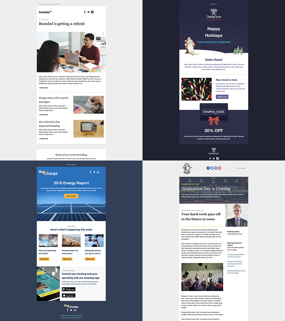
The fact is, good typography can enhance your email message, making it clearer and easier to read and understand. For example, check out how typography adds to these MailPoet email template designs:
The font you use in your emails could mean the difference between a subscriber clicking through to your site or deleting your email newsletter.
Understanding typography can help you choose the right fonts for your email, ensuring subscribers are more like to actually read your emails and act on your call-to-action. And not only that—it shows subscribers that you care about your message and design.
Understanding email safe fonts vs web fonts vs custom fonts
Unfortunately, you can’t just go and use a gorgeous font like Brandon Grotesque for your email copy. Due to the different interests and priorities of the big players in the email industry, there are still no email standards.
This means that when it comes to emails, there are limitations around responsive design and widths, coding and scripts, and fonts.
It’s generally best practice in email design to use email safe fonts (aka web-safe fonts). These fonts are reliable and they’re going to display as intended.
The most popular email-safe fonts are: Arial, Verdana, Helvetica, Georgia, Tahoma, Lucida, Trebuchet, and Times.
When you break it down, the best cross-platform email safe fonts are:
- Sans Serif – Arial, Arial Black, Tahoma, Trebuchet MS, Verdana. (Century Gothic, Geneva, Lucida, Lucida Sans, and Lucida Grande are also widely supported, but if you use these fonts be sure to specify a fallback font.)
- Serif – Courier, Courier New, Georgia, Times, Times New Roman. (MS Serif, New York, Palatino, and Palatino Linotype are also a widely supported, but again, specify a fallback font.)
- Monospace – Courier and Courier New. (Lucida Console and Monaco are widely supported.)
MailPoet supports these email safe fonts:
- Arial
- Comic Sans MS
- Courier New
- Georgia
- Lucida
- Tahoma
- Times New Roman
- Trebuchet MS
- Verdana
With MailPoet, you can also use the following custom webfonts:
- Arvo
- Lato
- Lora
- Merriweather
- Merriweather Sans
- Noticia Text
- Open Sans
- Playfair Display
- Roboto
- Source Sans Pro
Obviously, there are thousands more fonts available beyond the stock-standard email safe fonts. In fact, many companies and brands use custom fonts, i.e. typefaces that have been specially designed for a brand.
Custom fonts (aka brand fonts) allow you to stand out from the crowd and are a subtle—and sometimes even a not-so-subtle—branding move. They can be coded into an email, but often they’re simply added as an image at the top of the email.
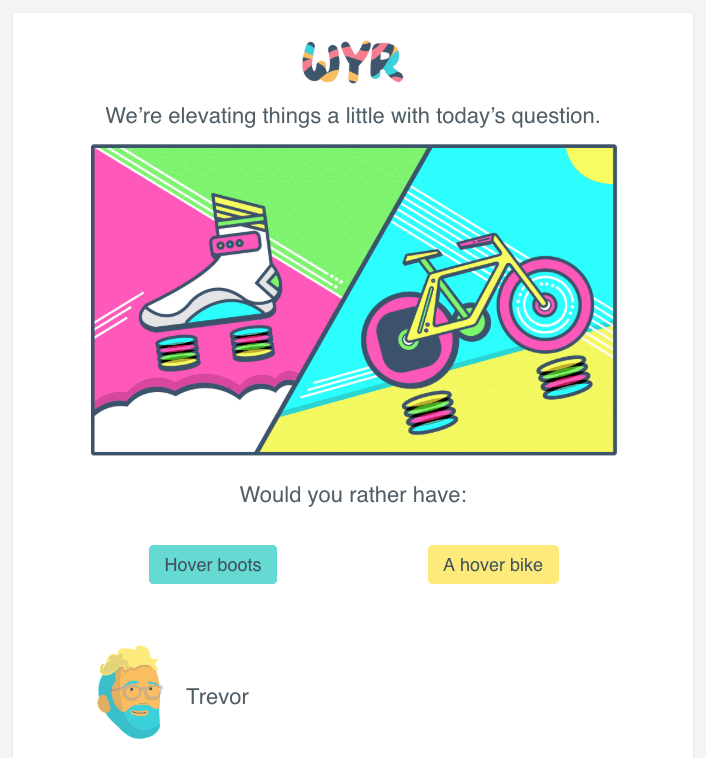
For example, Would You Rather uses a custom font for its logo, and for its emails uses an embedded image:
Then there are web fonts, which are designed specifically for the web rather than print. These include typefaces such as Open Sans, Roboto, and Lato, to name a few. Google Fonts is a popular free resources for finding and downloading webfonts.
If you decide to go with a webfont or custom font in your emails, it’s a good idea to always specify an email safe fallback font. This way, you’ll have a backup font in case your intended font doesn’t display.
Also, since there’s a chance your images might not display in some email clients, keep in mind that your most important information will need to be conveyed via text.
The 5 best fonts for email
There’s a lot of debate around which fonts are the best for email.
Some designers swear by the classics, including Times New Roman, Georgia, Verdana, Arial and Trebuchet.
However, according to email experts cited in Bloomberg’s article, Your E-mail Font Is Ruining Your Life, popular fonts like Arial and Helvetica, while beautiful in their neutrality, are kind of hard to read.
According to type designer Nadine Chahine, Helvetica’s letters are “too close together. That makes it too tight.”
Likewise, Arial also has ambiguous letter shapes, so says font designer Bruno Maag:
“If you imagine b, d, p, and q, those are letter forms that all the children always mess up. They are mirror forms of one another. That feature is emphasized in a font like Arial, where the shapes are literally mirror forms.”
Subscribers generally scan emails a couple of paragraphs at a time. So it’s important to use fonts that have letters with wide, consistent spacing for quick reading.
So which fonts should you use? There are three foolproof fonts that are widely supported across all types of devices and are easily readable.
Times New Roman
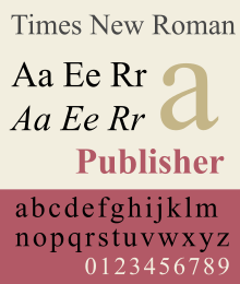
Did you know that the magazine The Times created this font in 1931? There’s a good reason that it’s been used for nearly 90 years. It’s a serif design, meaning that letters have exaggerated strokes. Microsoft Office, for example, uses it as their default font. It’s professional and has an editorial feel to it, making it ideal for emails.
Georgia
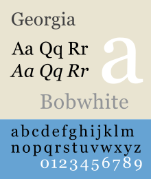
Similar to Times New Roman, Georgia is another serif font, and was originally designed for Microsoft in 1993. It has been used for novels and newspapers for many years, giving it an authoritative appearance and history. The heavy strokes and generous spacing make it very easy to read and help with keeping the eyes flowing on to the next word.
Verdana
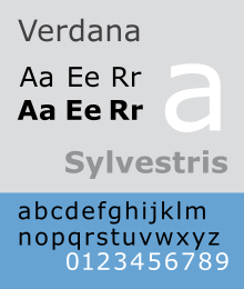
Designer Matthew Carter named this font after his daughter, Ana, and mixed it with the word verdant. It is recognized as one of the most easily read fonts available. The letters are evenly and similarly shaped to create consistency and clarity. Specifically lower case letters are larger, making it easy to read for all ages.
Whatever fonts you use, keen in mind that you want to be consistent and simple is best—stick to a maximum of three fonts or less.
Tips for typography in email
Now that you understand the various types of fonts you can use and which ones are most effective, here are some practical tips for optimizing your typography in different ways.
1. Choose the right body font
The majority of what people will read in your emails is the body copy. For body copy, it’s best to use a font that is readable yet neutral. You don’t want to distract from any display text or headlines.
The font that you use for the body of an email will influence how people interpret your message. For example, Comic Sans would give your copy a casual tone and is best used for humorous messages. On the other hand, if you’re sending an email newsletter, pitch, or business-related email, something clean and crisp like Arial would be more appropriate.
2. Establish your identity with a strong headline font
The headline font of your email allows your copy and message to stand out. It will catch the subscriber’s attention, which should also have a benefit or value proposition in it.
A strong headline font acts a slippery slope, getting your readers to continue flowing through the body until they reach a call-to-action. It doesn’t necessarily have to be a completely different font, either. It can be the same as the rest of the email, but bolded or italicized to stand out.
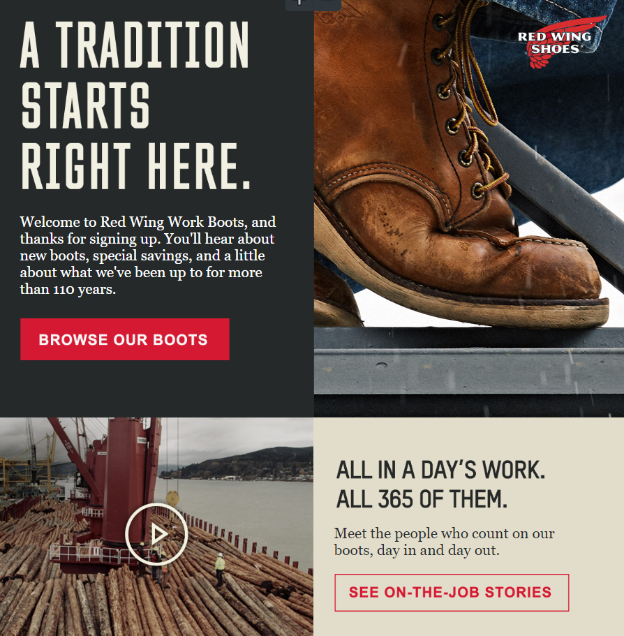
Check out how Red Wing Work Boots makes its headline stand out from the rest of the newsletter.
3. Font size matters
If your font size is too small, readers will need to take out a magnifying glass to read the email. Too big, and they’ll need to scroll 100 times to get to the end. This is why font size is so crucial—it needs to be easy to read, but not overwhelming at the same time.
And just like web pages, subscribers typically scan through emails to find what they want, rather than reading every single word. Having a larger font size makes this process easier, helping to increase response rates and click-throughs.
At MailPoet, we recommend these font sizes:
- Header: 22-28 pixels
- Body text: 15-18 pixels
The exact font sizes you use will depend on your font, so experiment with your design, and don’t forget to account for users on mobile phones—you don’t want your text looking too big (or too small!) or smaller devices.
4. Line spacing also matters
You can choose the perfect font, but if the letters are squished together, nobody will be able to read your words. This is where line spacing, aka line-height, comes into play.
Line spacing is the space between each line or paragraph. Too little, and your email body will look like one block of text. Too much, and the page may appear broken or disjointed.
The ideal line space is around 1.4-1.5. Different typefaces will require different line spacing, so again, experiment with your sizing to see what works for your emails.
Here, you can see how Vimeo uses a generous amount of line spacing in this email to make its message easier to read:

5. Format your links
Imagine this: your subscribers have made it to the end of the email and they’re ready to click-through to your site, but they miss your link because you didn’t format it properly, making it indistinguishable from the rest of your body text.
This can happen for a few different reasons. The first being that your links simply don’t stand out. This about it this way: When you see a blue link on a web page, what do you immediately recognize it as? A hyperlink, right?
With this in mind, ensure that you format your links to ensure your links aren’t missed. Using images or buttons is one way to style links to URLs. Not only are they easy to see right away, but they’re easier to tap on mobile devices.
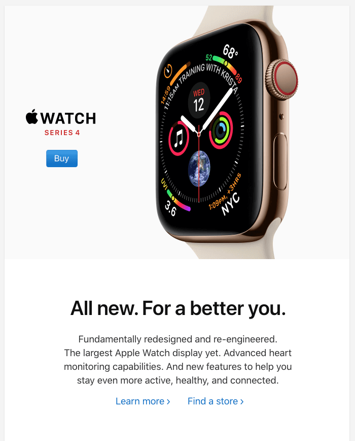
Apple, for example, uses simple blue text to highlight its links:
6. Be mindful when using color
When using color, stick to what you’re already using for your brand and website for consistency. After all, it would be strange to have a black and white website and use pink in your emails!
It’s best to keep your use of colors simple and use three colors at most so your design looks pleasing to the eye and not cluttered or confusing.
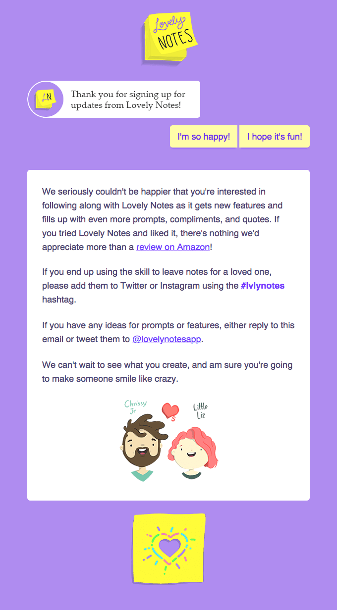
Check out how Lovely Notes uses purple and yellow for a pop of on-brand color in its emails:
Wrapping up
When it comes to typography and email, there’s a lot to consider, including whether you want to experiment with custom fonts or webfonts, stick with the three foolproof typefaces I mentioned above, or go all-in with custom-designed images.
For emails, it’s important that you clearly convey your message. So choose fonts that match your brand but are legible and easily readable. It’s also a good idea to send test your emails to different devices, such as your desktop and mobile phone, so you can how your emails will look for your subscribers.


